
Introduction
Headers are like newspaper headlines: big, bold, and loud. Their only aim is to draw your attention to a story in a short space of time. The header is the first thing a visitor sees on a website, so it sets the tone for the rest of the site, and must be styled properly. It should contain readable text that visitors can process quickly, which increases the likelihood that they’ll scroll or click through the site.
A website has roughly 500 milliseconds (0.05 seconds) to make an impression, so let’s learn how to make them count!
In this post, we’ll look at five cool ways to style headers with CSS:
- CSS text color gradients
- Add a background image behind text with CSS
- Add shadows to text in CSS
- Typewriter effect with HTML and CSS
- Gradient text animation
We’ll also cover some useful tips for styling header texts and each style’s cross-browser compatibility.
What is a header?
As discussed above, the header is the first section on a webpage and typically contains a bold heading text in a large font, some descriptive text in a smaller font, an image, and call-to-action buttons.
Let’s have a look at an example:

The main header text is designated with the h1 tag, which is the most important HTML header tag. Our focus in this tutorial will be on styling this header.
Useful tips for styling header texts
Before we jump into the tutorial, let’s review some best practices for styling headers to help you make the most impact without alienating your users.
Pick the right colors
The header is the first thing a visitor sees, so it’s important to make a good impression. If you’re working with brand colors for styling, focus on the main primary colors. If you aren’t working with set brand colors, use colors that compliment each other. If you don’t know what works, take your time to research.
Make it unique
The main header text should be different from any other heading on the website. It should stand out; its styling shouldn’t be replicated anywhere else. In fact, only one h1 header tag should be on a single webpage, as this is good for SEO.
Performance might be reduced if your header’s styling is repeated, as a lot of resources may be used to display the header. The browser should only need to make this effort once.
Use the right fonts
Everything from size, color, weight, and typeface can make a difference between the perfect, readable header text and visual mayhem. I know the creative juices are flowing, but don’t be afraid to tone it down when needed. The header text needs to be readable.
Check compatibility
There’s a great website, CanIUse, that’ll help you know the browser compatibility of CSS properties. We’ll use it in the browser compatibility section to detail the support for features used in this post.
CSS text color gradients
A color gradient is a transition between two or more colors where the colors blend into each other. There are three ways to add color gradients to your header text in CSS:
linear-gradient()radial-gradient()conic-gradient()
1. linear-gradient()
Using this function, the colors transition in a straight line.
To get started, set up a header with HTML:
  <body>
<header>
<h1>Modern Frontend Monitoring and Product Analytics</h1>
</header>
</body>
You could use the semantic tag, header, as shown, or a section tag with an ID or the tried-and-true (and overly used) [div] with a class="header". All that really matters here is that your header text is on the first section of the website and it’s recognizably the header text.
The linear-gradient() function allows you to add specific parameters, which include the direction of the gradient and at least two color values. There’s no limit on the number of colors you can add.
Let’s demonstrate with CSS:
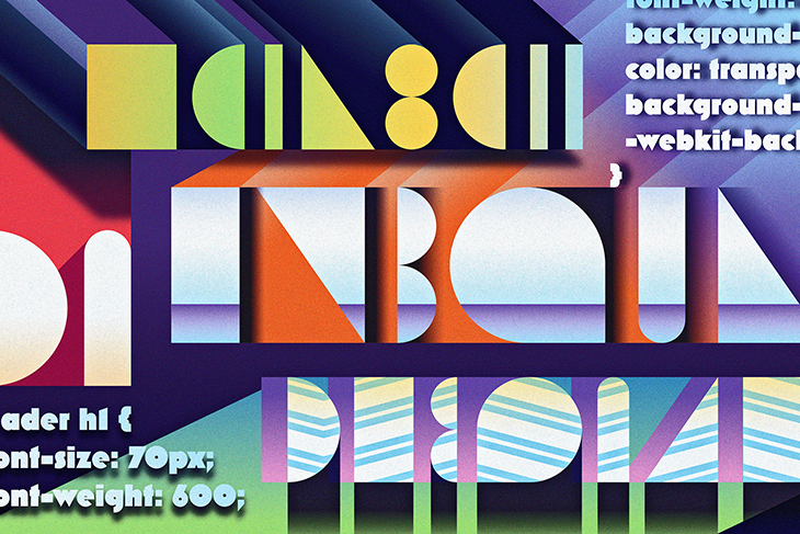
header h1 {
font-size: 70px;
font-weight: 600;
background-image: linear-gradient(to left, #553c9a, #b393d3);
color: transparent;
background-clip: text;
-webkit-background-clip: text;
}
The background-clip property ensures that the background doesn’t extend beyond an element — in this case, the text. The color prop is set to transparent so that you can see the background directly behind the header.
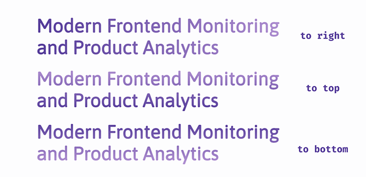
The result of the above code is that the dark color transitions into the lighter color from the right end of our header text towards the left:

You could style the header with the text color gradient moving in other directions:
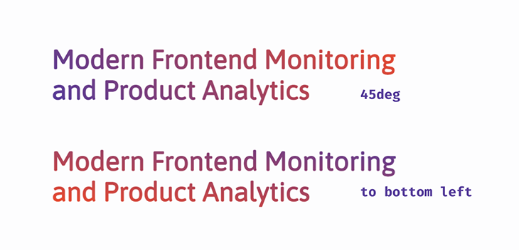
You can also make the linear-gradient() diagonal:
linear-gradient(to bottom left, #553c9a, #ee4b2b);
And the diagonal direction can be stated using angles:
linear-gradient(45deg, #553c9a, #ee4b2b);
We can specify when the color transition begins in our header by adding a percentage value after the first color:
linear-gradient(to right, #553c9a 45%, #ee4b2b)
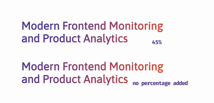
In the above example, the first color (purple) takes up 45 percent of the header text before it starts transitioning into red.
2. radial-gradient()
This gradient starts at a point of origin from which colors “radiate” outwards. By default, the color transition starts from the center of the element, your header.
background-image: radial-gradient(#553c9a, #ee4b2b);
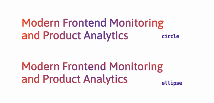
We can’t specify direction with the radial-gradient(), but what we can do is specify the shape of the gradient. There are two choices we can use for our header: a circle or an ellipse.
radial-gradient(circle, #553c9a, #ee4b2b);

radial-gradient(ellipse, #553c9a, #ee4b2b);
There are also four parameters that can be added to change the position of the gradient:
closest-sideclosest-cornerfarthest-sidefarthest-corner
Stay tuned, and we’ll see how these can work on our header text in a later section.
3. conic-gradient()
This gradient also has a point of origin, but now the color transition rotates around that point. To really see what’s going on in our header text, let’s add a third color.
background-image: conic-gradient(#553c9a, #ee4b2b, #00c2cb);
The result:

We can smooth the harsh starting point — where the light teal sharply transitions to purple in the letter N in the above diagram — by adding the first color to the end of the function.
conic-gradient(#553c9a, #ee4b2b, #00c2cb, #553c9a);
You can also control where color transitions begin in the header text by adding percentage values after each color.
conic-gradient(#553c9a 30%, #ee4b2b 40%, #ee4b2b 70%, #00c2cb 80%, #553c9a);
The result:
This can be used to create a gradient pattern that’s simultaneously not a gradient! This is because we’ll get solid colors all around.
conic-gradient(
#553c9a 0%, #553c9a 33%, #ee4b2b 33%, #ee4b2b 66%, #00c2cb 66%, #00c2cb 99%
);

Let’s explain what’s happened. The first color moves from the start point, 0``%, and rotates over 33% of the area of the header text. Normally, this is when it’s supposed to start transitioning into the next color, but that color has been set to start at 33%, so it changes immediately at that point. This continues on for all the color stops.
Bonus: Repeating gradients
I know we said there are three ways you can use gradients, but I have one last trick up my sleeve!
As the name suggests, the text color gradient is repeated throughout the header. Add in specific color stops, and you’ll get interesting gradient patterns on the header.
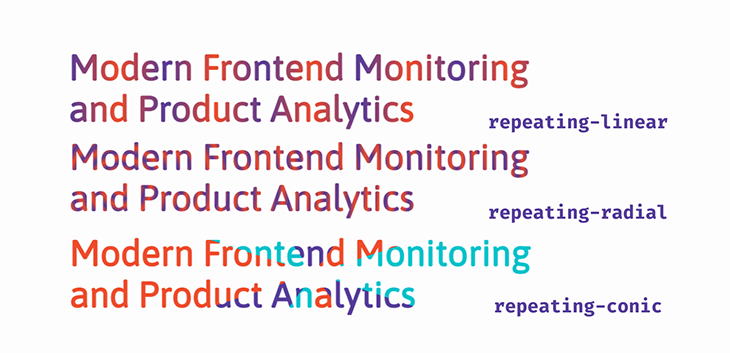
You can have repeating-linear-gradient(), repeating-radial-gradient() and repeating-conic-gradient().
repeating-linear-gradient(to right, #553c9a, #ee4b2b 10%, #553c9a 20%);

repeating-radial-gradient(circle closest-corner at 100px 100px, #553c9a, #ee4b2b 10%, #553c9a 20%);

repeating-conic-gradient(#553c9a 0%, #553c9a 10%, #ee4b2b 10%, #ee4b2b 20%,
#00c2cb 20%, #00c2cb 30%);
It’s important to note, after looking at the above example, that unless your plan is to give your visitors a bad case of visual vertigo, you’ll still need to adhere to some best practices when using these gradients.
Use shades of the same color
To get the repeating-radial pattern in our header, from the example above, we used this syntax:
repeating-radial-gradient(circle closest-corner at 100px 100px, #553c9a, #ee4b2b 10%, #553c9a 20%);
Now swap out the red for a light shade of purple:
repeating-radial-gradient(circle closest-corner at 100px 100px, #553c9a, #b393d3 10%, #553c9a 20%);
The result is a header that’s much easier on the eyes:

You can also use colors from the same family, rather than tints of the same color. For example, warm colors like yellow and orange go well together, and the same goes for cool colors, like blue and green.
Use the right parameters
Remember those four parameters you can use with radial-gradient? We’ve already seen one from the snippet above, but let’s take a closer look.
repeating-radial-gradient(<ending-shape> <size> <position> ,<color1>, <color2>, <color3>);
The ending shape of the gradient can be a circle or an ellipse. By default, it’s an ellipse with the position at the center.
The size of the shape can be defined using any of these four parameters:
closest-side— The ending shape of the gradient meets the side of the element closest to its centerclosest-corner— The ending shape of the gradient meets the closest corner of the elementfarthest-side— The ending shape of the gradient meets the side of the element farthest from its centerfarthest-corner— The ending shape of the gradient meets the corner of the element farthest from its center
Next is the position of the origin from any corner or side. It can be a percentage or length value.
After these come the color stops; we should have at least two, but, as already established, having the first color as a third color helps create a smoother transition.
Enough talk; have a look for yourself. For clarity, we’re going with the colors purple and red so you can see what’s happening to the gradient:
For repeating-radial-gradient using the closest- values:
Now using the farthest- values:
There isn’t much difference between the first two headers because the gradient is “radiating” or stretching outwards. This result is something we can easily get using linear-gradient. The best option would be to specify a shape and defining when the color transitions begin; see the third header in the demo.
So, we’ve seen that using the repeating-radial-gradient property with closest-side or closest-corner produces better patterns in the header, but lessens readability if the wrong colors are used. Using farthest-corner or farthest-side the header produces clearer text, even with contrasting colors. The choice is yours.
Add a background image behind text in CSS
This is very straightforward. Instead of painting a background image, as with the gradients, you’re placing a preexisting image on the background of the header text using the url() function.
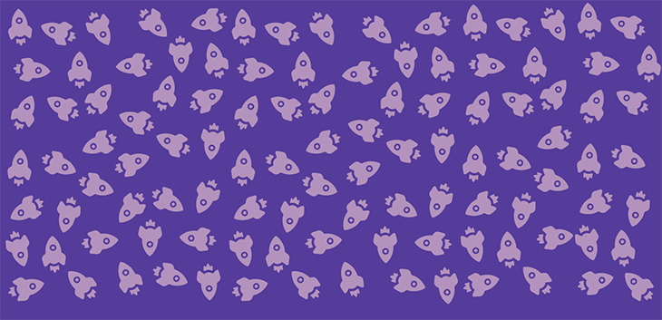
First, you’ll choose an image. Here’s the one we’re using for this demo:
Now, for the CSS, use the background-image property and url() to add it to your header. You can adjust the background-size and background-repeat properties.
header h1 {
font-size: 70px;
font-weight: 600;
background-image: url(/rockets.png);
background-size: 250px;
background-repeat: repeat;
color: transparent;
-webkit-background-clip: text;
background-clip: text;
}
The result:

Easy-peasy!
Add shadows to text in CSS
The text-shadow property is used to add a shadow around text. Let’s look at how it’s declared in CSS:
text-shadow: 0px 4px 10px rgba(179, 147, 211, 0.8)
It contains four values:
x-offset, the shadow’s horizontal positiony-offset, the shadow’s vertical position- The blur radius, which defines how light or how dark the shadow will be
- The color
This property can be styled like the box-shadow property. However, it’s best to keep in mind that with the box-shadow, your concern is the entire box or container, but with text-shadow, you have to pick what looks best on each letter.
One of the best ways to add shadows is by layering. Let’s start by giving our header a simple layered shadow effect.
  text-shadow: 2px 2px 4px rgba(179, 147, 211, 0.1),
3px 4px 4px rgba(179, 147, 211, 0.15),
4px 6px 4px rgba(179, 147, 211, 0.2),
5px 8px 4px rgab(179, 147, 211, 0.25);
And this will be the output:

Still using layered shadows, we can make the header text glow. Start by adding a dark background-color. Set the offset values on the text-shadow to 0, set a blur radius value; this way, the glow will be spread evenly around each letter in the text. Finally, add in a bright color for the text-shadow and a few layers, and that’s it! You have a glowing header.
body {
background-color: #301934;
}

header h1 {
font-size: 70px;
font-weight: 600;
color: #fdfdfe;
text-shadow: 0px 0px 5px #b393d3, 0px 0px 10px #b393d3, 0px 0px 10px #b393d3,
0px 0px 20px #b393d3;
}
The output:

3D header text
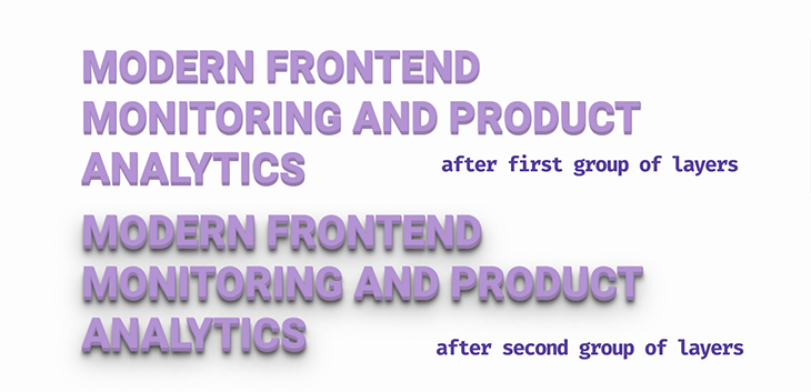
Now for some 3D text. For this effect, a bold/block font-family is preferable, such as Roboto from Google Fonts. Let’s have a look at what we’re aiming for:

There are two groups of layered shadows working together to produce this effect.
First, there’s a tightly packed group of solid-colored text-shadow layers, with very little blur and 100 percent opacity, which help create the edges and sides of the text.
Second, you add shadows with increasingly wider offsets and blur radiuses, and rgba() color values to create the shadow effect:
text-shadow: 1px 1px 1px #957dad,
1px 2px 1px #957dad,
1px 3px 1px #957dad,
1px 4px 1px #957dad,
1px 5px 1px #957dad,
1px 6px 1px #957dad,
1px 10px 5px rgba(16, 16, 16, 0.5),
1px 15px 10px rgba(16, 16, 16, 0.4),
1px 20px 30px rgba(16, 16, 16, 0.3),
1px 25px 50px rgba(16, 16, 16, 0.2);
Transform the text to uppercase so it stands out more. Here’s the complete CSS syntax for the header text:
@import url('https://fonts.googleapis.com/css2?family=Roboto&display=swap');

header h1 {
font-size: 70px;
font-weight: 600;
font-family: 'Roboto', sans-serif;
color: #b393d3;
text-transform: uppercase;
text-shadow: 1px 1px 0px #957dad,
1px 2px 0px #957dad,
1px 3px 0px #957dad,
1px 4px 0px #957dad,
1px 5px 0px #957dad,
1px 6px 0px #957dad,
1px 10px 5px rgba(16, 16, 16, 0.5),
1px 15px 10px rgba(16, 16, 16, 0.4),
1px 20px 30px rgba(16, 16, 16, 0.3),
1px 25px 50px rgba(16, 16, 16, 0.2);
}
Adding multicolored text-shadow layers in CSS
Let’s have more fun and do something fancy: multicolored text-shadow layers on the header text. Fancy shadows call for a fancy font-family, and there’s nothing fancier than cursive font types, so we’ve gone with Niconne.
Take the above example and remove the second group of shadows, while keeping the solid colors. Now we get creative — let’s mix and match colors.
@import url('https://fonts.googleapis.com/css2?family=Niconne&display=swap');

header h1 {
font-size: 90px;
font-weight: 600;
font-family: 'Niconne', cursive;
color: #e0d6e9;
text-shadow: 2px 2px 0px  #957dad,
4px 4px 0px #ee4b2b,
6px 6px 0px #00c2cb,
8px 8px 0px #ff7f50,
10px 10px 0px #553c9a;
}
The result:

Make sure the text-shadow offsets are evenly spaced so you don’t end up with lopsided text. Choosing, and styling, the right font-family can make all the difference. Tweak the font-size or font-weight and try out different font variations and colors to find what works best for you.
Typewriter effect with HTML and CSS
This is an animation effect that makes each letter appear on the page, one after the other, like it’s being typed.
To do this effectively, you’ll need a short header text — one line max — and a monospace font type, such as Courier, Inconsolata, Anonymous Pro, or Source Code Pro from Google Fonts. All the letters and characters are monospace, or have the same width.
First up, set up the header with HTML:
  <body>
<header>
<h1>This is a Header</h1>
</header>
</body>
Now, style with CSS. We’re going to add a blinking cursor to the end of our header text with the border-right property:
header h1 {
font-size: 70px;
font-weight: 500;
color: #553c9a;
border-right: 4px solid #000; /*This will be the blinking cursor*/
}
This is the output at this point:

Add a blinking cursor
Now, define two animation properties for the header text and the cursor. We’re naming the blinking animation cursor.
animation: cursor 1s infinite step-end;
Use @keyframes to define the animation. You want it to blink; that means it goes from being visible to being hidden. To do this, use the border-color property and define specific points for when it’s hidden, transparent, and visible.
@keyframes cursor{
0%, 100%{border-color: transparent;}
50%{border-color: #000;}
}
A number of things are going on here, so let’s break it down. The blinking animation is going to last 1s. At the start, the border-color is transparent, as defined by the @keyframes. At the half way point — that is, 50% of 1s — it changes to black and then returns to being transparent, at 100%. This animation continues in an infinite loop.
By default, the cursor will fade or ease in and out, but that’s not how a blinking cursor behaves, so the animation timing will be set to step-end. This means the animation will jump to each stop point defined in the @keyframes function.
Adding typewriter animations with CSS
Now let’s add the animation properties for the header. You want each letter to appear one at a time, then it’ll be deleted, and then it repeats. For this, use the width property with a unit of ch — that’s the number of characters in the header text.
We’re still using the step function, but this time the number of stop points will be set, and that’ll be equal to the number of characters.
animation: cursor 1s infinite step-end, typing 15s infinite steps(16);
white-space: nowrap;
overflow: hidden;
The white-space property will stop the words and letters from stacking on top of each other and overflow: hidden keeps the other letters hidden until they’re “typed” onto the page.
Now for the @keyframes, we’re going to define each stop throughout the duration of the animation.
@keyframes typing{
0%{ width: 0ch} /*Text is hidden*/
30%{ width: 16ch;} /*The enitre header will be typed out 1 character at a time*/
80%{ width: 16ch;} /*Text stays visible*/
90%{ width: 0ch;} /*Text is deleted*/
100%{ width: 0ch;} /*Text stays hidden*/
}
The result:
Multiple text typing animation
An alternative to the method we used above is to change some words in the header and replace them with new words. We can do this using an unordered list, ul. The words that are going to be typed will go into the list.
Now, create the HTML syntax and define which part of the header will be fixed and which part will be typed:
<body>
<div class="header">
<div class="fixed">This is a</div>
<ul class="typed">
<li><span>Caption</span></li>
<li><span>Title</span></li>
<li><span>Header</span></li>
</ul>
</div>
</body>
Give the .header a display of inline-flex so the fixed text is aligned with the list. Next, style them to your liking.
.header{
display: inline-flex;
}
.header .fixed {
font-size: 70px;
font-weight: 500;
color: #b393d3;
}
.header .typed{
margin-left: 20px;
line-height: 90px;
height: 90px;
}
.header .typed li{
color: #553c9a;
font-size: 70px;
font-weight: 600;
list-style: none;
position: relative;
top: 0;
}
Now create a :before pseudo element of the words wrapped in the span tag.
.header .typed li span{
position: relative;
}
.header .typed li span::before{
content: '';
position: absolute;
height: 100%;
width: 100%;
left: 0;
border-left: 2px solid #553c9a;/*Blinking cursor*/
}
This is the output at this point:

Now for the animation. We’ll start with the cursor; it’ll be the same as the previous example and be added to the pseudo span. To get the typing animation, start by hiding the words that are going to be typed on the page by adding a background to the pseudo span with the same color as the background of the webpage.
.header .typed li span::before{
content: '';
position: absolute;
height: 100%;
width: 100%;
left: 0;
border-left: 2px solid #553c9a;
background: #fdfdfe;
animation: cursor 1s infinite step-end, typing 1.5s steps(8) infinite;
}
Now the @keyframes:
@keyframes cursor{
0%, 100%{border-color: transparent;}
50%{border-color: #553c9a;}
}
@keyframes typing{
100%{ left: 8ch;} /*Use the number of characters in the longest word*/
}
With this, the letters in the header will be revealed, one character at a time, as the horizontal position of the cursor is pushed from the left (and toward the right).
Finally, we want the text to change after each typing cycle, so we need another animation for the typed list.
animation: slide 4.5s steps(3) infinite;
Next, @keyframes. We’ll slide the list up so a new word can be revealed after each step:
@keyframes slide{
100%{
top: -270px;/*Height of the words times 3*/
}
}
>
There you go, you’ve created the multiple text typing effect for your header.
You really have to be careful when choosing the right duration for this animation. You don’t want the text to change halfway through the typing. All three animations, cursor, typing, and slide, have to work together seamlessly.
Gradient text animation with CSS
Once more, we’re taking the text color gradients to another level with animation. First, we’re going to create an infinitely animated linear-gradient().
Create a header with at least three color values in the gradient. We’re going to use five in our demo:
background-image: linear-gradient(to right ,#553c9a, #ee4b2b, #00c2cb, #ff7f50, #553c9a);
Right now, you’ll see this:

The aim is for at least two colors to be visible in the header text at the start of the animation. So you’ll have to adjust the background-size and background-position.
background-size: 200%;
background-position: -200%;
Play with the values until you get your preferred start colors.

Next, add the animation property and then @keyframes, targeting the background-position.
animation: animated-gradient 2s infinite alternate-reverse;


@keyframes animated-gradient{
to{
background-position: 200%;
}
}
Basically, we are moving the background directly opposite its original position and back again. This is the result:
https://codepen.io/oscar-jite/embed/dyZJmxp
Let’s try something different: triggering the gradient animation on :hover. Start by replacing animation with the transition property.
transition: all ease-in-out 2s;
Then add the :hover pseudo element:
header h1:hover{
background-position: 200%;
}
Hover on the text below to check it out.
Cross-browser compatibility
For color gradients
Linear and radial gradients are supported across all modern browsers. They are supported on older versions of browsers with the webkit prefix. The conic-gradient is only supported on desktop, by Chrome and Safari. You can check what gradient works for each browser on CanIUse.
For background-image
This property is supported on all browsers except Internet Explorer versions 6-8 and Firefox 2-3.5.
Firefox 3.6 requires the moz prefix. Opera 10.1 requires the o prefix.
We used background-clip in the demo. This property is supported on all browsers except Internet Explorer, Firefox 2-48 and Opera 10-21. You’ll need the webkit extension for nearly all other browsers. Some browsers don’t require vendor prefixes, including:
- Microsoft Edge 15-18
- Every version of Firefox after 48
- All versions of Safari from 14 to present
Microsoft Edge 12-14 require the ms extension.
For text-shadow
The text-shadow prop is supported on all modern browsers. It has partial support on Safari 3.1 and 3.2; they don’t support multiple shadows. It doesn’t need vendor prefixes to work.
For the typewriter effect
This is a bit complicated. We’re dealing with the animation property, which is supported on all modern browsers. Older browsers, Chrome 4-42, Safari 4-8, and Opera 15-29, require the webkit extension. Firefox versions 5-15 require the moz extension.
The :before pseudo element is supported on all browsers, old and new, except, you guessed it, Internet Explorer 6-7. Also, Internet Explorer 8 doesn’t support double column pseudo classes.
However, we used the step timing function in the demonstration, which isn’t supported on most older browser versions. For full support details on this effect, see CanIUse.
Conclusion
You have 500 milliseconds to make an impression and we’ve just shown you five ways of doing just that. We’ve looked at various color gradient headers, text with an image for its background, you’ve seen the header glow, the typewriter effect and, finally, gradient text animation.
Do you think you can do better than the given examples? Go for it! Make some unique header texts.
на главную сниппетов