 на главную сниппетов
Nowadays, it’s not enough that a website does its job — it has to take the user on a journey, an aesthetically pleasing journey of hues, fonts, shades, and everything in between. Websites have to look and feel realistic, and shadows play a big part.
In this post, we’ll look at the box-shadow CSS property and how you can style it in three different ways:
We’ll also cover:
box-shadow property?box-shadowsbox-shadow with the :hover pseudo class and transform propertybox-shadow browser supportbox-shadow
This is intended for frontend developers with a working knowledge of HTML and CSS. You should also be familiar with the box-shadow property.
box-shadow property?
The box-shadow property allows you add a shadow around an element on a webpage. It can tell us if an element like a button, navigation item, or a text card is interactive.
Our eyes are used to seeing shadows. They give an idea of an object’s size and depth, and the box-shadow brings this realism into our online experience. When styled properly, it can improve the aesthetics of the webpage.
Let’s look at how a typical box-shadow in declared in CSS:
box-shadow: 0px 5px 10px 0px rgba(0, 0, 0, 0.5)
The first four values are:
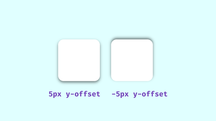
x-offset, which represents the horizontal shadow positiony-offset, which represents the shadow’s position vertically
All of these except the blur radius can be negative values. For instance, the snippet above will place the box-shadow on the bottom of the element, but if you add negative values like below, the shadow will be on top:
box-shadow: 0px -5px 10px 0px rgba(0, 0, 0, 0.5)
The spread value set at 0px will make the shadow the same size as the box; a positive value will increase its size and a negative value will shrink it.
The next value is the color. We’ll be using rgba() colors because of their alpha value. With this, we can specify opacity, which is an important aspect to consider when styling realistic shadows. Shadows in well-lit spaces aren’t black or completely opaque, you can see the color of the area the shadow is cast on.
When styling the box-shadow property, remember that transparent shadows are the best because they look great on multicolored backgrounds. Look around and observe how shadows behave in relation to their light sources; you’ll want to keep this in mind when styling with CSS.
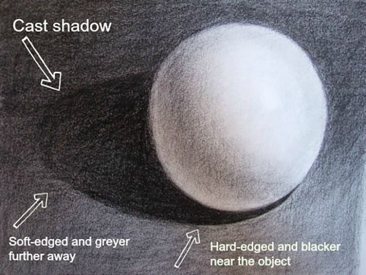
The area closest to the object has the darkest shadows, then it spreads and blurs outwards gradually. Opaque or completely black shadows would be distracting, ugly, and imply a complete blockage of light, which isn’t what we’re after.
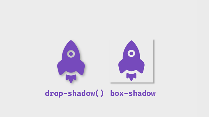
dropshadow() filter
This is a filter that adds a drop shadow around an image. It’s not the same as box-shadow, which is important to note when adding shadows to images.
The below code snippet shows the distinction between these filters.
box-shadow: 5px 5px 5px 0px rgba(0,0,0,0.3);
    filter: drop-shadow(5px 5px 5px rgba(0,0,0,0.3));
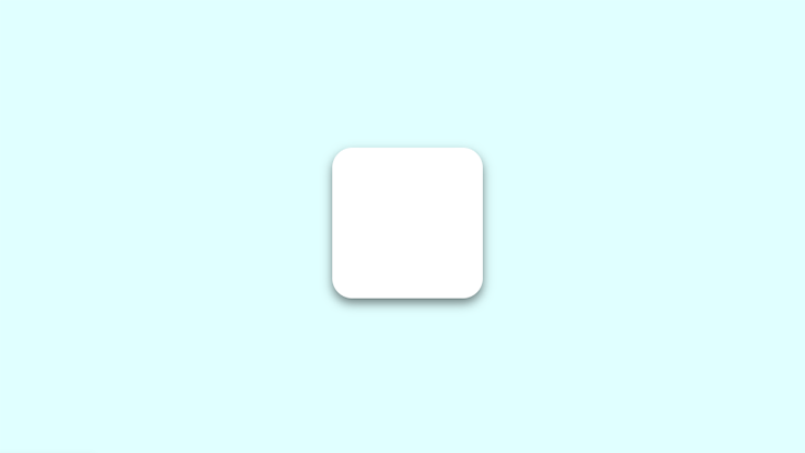
box-shadowsTo get started, first create a simple box container with HTML:
<body>
<div class=box>
</div>
</body>
Next, the CSS:
div{
    height: 150px;
    width: 150px;
    background: #fff;
    border-radius: 20px;
}
.box{
    box-shadow: 0px 5px 10px 0px rgba(0, 0, 0, 0.5);
}
This will be the output:
box-shadow with the :hover pseudo class and transform property
The box-shadow can also be affected by the :hover pseudo class. You could add a shadow to a component that didn’t previously have one, or make changes to an existing shadow. In this example, the transform property modifies our shadow.
.box:hover{
    box-shadow: 0px 10px 20px 5px rgba(0, 0, 0, 0.5);
    transform: translateY(-5px);
}
The transform property aids the illusion of the box being lifted further off the page. In this example, the translate() function is used to resize the box.
The inset keyword can be added to put the shadow inside the frame of the box or element. The box will appear to have sunk into the page.
.box2{
    box-shadow: inset 0px 5px 10px 0px rgba(0, 0, 0, 0.5);
}
.box2:hover{
    transform: translateY(5px);
    box-shadow: inset 0px 10px 20px 2px rgba(0, 0, 0, 0.25);
}
Basically, you can play with the values until you get what you like. This is what the final shadows will look like using these examples:
An alternative to the translate() function is scale(). While translate() changes the shadow position along the x- and y-axes, scale() increases the size of the box along the x- and y-axes.
Let’s demonstrate. On the second box, add the scale() value on :hover:
.box2:hover {
    transform: scale(1.1);
    box-shadow: 0px 10px 20px 2px rgba(0, 0, 0, 0.25);
}
This will increase the size of the box by 1.1x the original size.
You don’t want ugly, botched, or boring shadows that look amateurish on a webpage. There are a number of ways to improve the look of the box-shadow and use it nicely and effectively — all of which I’ll explain in the following sections.
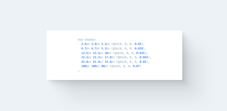
box-shadowYou can stack multiple shadows on top of each other by separating their values with commas. This technique can be used to create interesting shadows that blend smoothly into the page.
Let’s demonstrate with CSS:
box-shadow: 0px 1px 2px rgba(0,0,0,0.1),
0px 2px 4px rgba(0,0,0,0.1),
0px 4px 8px rgba(0,0,0,0.1),
0px 8px 16px rgba(0,0,0,0.1);
Notice the spread value isn’t added — it’s not really needed in this case, but ultimately, it’s up to you to decide how your box-shadow looks.
If we set the offset and blur radius to 0px and add a spread value to one shadow, we will add a border to the box.
box-shadow: 0px 0px 0px 2px rgba(0,0,0,0.5),
0px 2px 4px rgba(0,0,0,0.1),
0px 4px 8px rgba(0,0,0,0.1),
0px 8px 16px rgba(0,0,0,0.1);
Since this border is technically a shadow because no extra space is taken up by the box in the parent element.
This is what the output will look using these two techniques:
Notice the smooth subtle shadow on the left box. The box on the right shows the shadow border.
Now, let’s look at the box-shadow in a practical scenario. This property can be used on almost any element on a webpage, but the more common ones include the navbar, text cards, and images. It can also be added to input fields and buttons.
Build a simple webpage like the one shown in the demo, and try styling the box-shadow yourself!
box-shadowReal-life shadows are usually black or gray, with varying amounts of opacity. But what if shadows had colors?
In the real world, you get colored shadows by changing the color of the light source. There’s no “real” light source equivalent to change on a website, so you get this neon effect by changing the color value on the box-shadow.
Let’s change the color on our first example:
.box{
    box-shadow: 0px 5px 10px 0px rgba(0, 0, 0, 0.7);
}
.box2{
    box-shadow: inset 0px 5px 10px 0px rgba(0, 0, 0, 0.7);
}
This is the output:
You can get a more vibrant glow by layering the shadows:
box-shadow: 0px 1px 2px 0px rgba(0,255,255,0.7),
1px 2px 4px 0px rgba(0,255,255,0.7),
2px 4px 8px 0px rgba(0,255,255,0.7),
2px 4px 16px 0px rgba(0,255,255,0.7);
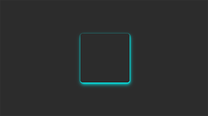
The best way to showcase colored shadows, especially neon ones, is on a dark-themed webpage. Dark themes are very popular and this effect can complement it nicely if you use the right colors.
All the heavy lifting has been done in the previous examples, so let’s darken the earlier site demo and see the result!
It’s best to use colors that contrast well, as we’ve done in this demo. The blue box-shadow stands out well against the dark background. To make it brighter, you can increase the opacity.
box-shadowThis effect is unique and visually pleasing. It came from skeuomorphism, which tried to replicate objects exactly as they would appear in real life. There are some examples in the linked article on skeuomorphism, but a quick example is the early Apple device UI.
The first two effects we need to create deal with flat web components that seem to float above the page and cast shadows on the background. This effect makes these components look like they extrude from the page.
box-shadow: -10px -10px 15px rgba(255,255,255,0.5),
10px 10px 15px rgba(70,70,70,0.12);
We can also place them on the inside:
box-shadow: inset -10px -10px 15px rgba(255, 255, 255, 0.5),
    inset 10px 10px 15px rgba(70, 70, 70, 0.12);

There are two box-shadows working opposite each other in the above example. The white box-shadow shows the direction of the light source and serves as a highlight. It’s similar to what we see in real life.
Neumorphic design mimics real life objects. It doesn’t entirely replicate things, but it looks real enough, like you could reach out and touch it.
Now let’s create something cool, a push switch using a checkbox.
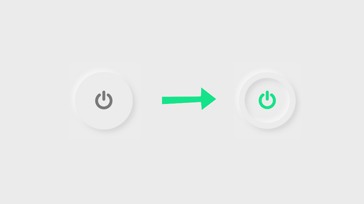
To get started, create a checkbox input.
<body>
<input type="checkbox" />
</body>
Now for the CSS:
input[type="checkbox"] {
    height: 200px;
    width: 200px;
    top: 50%;
    left: 50%;
-webkit-appearance: none;
    box-shadow:
-10px -10px 15px rgba(255, 255, 255, 0.5),
10px 10px 15px rgba(70, 70, 70, 0.12);
    position: absolute;
    transform: translate(-50%, -50%);
    border-radius: 50%; /*Makes the circle*/
    border: 20px solid #ececec;
    outline: none;
    display: flex;
    align-items: center;
    justify-content: center;
    cursor: pointer;
}
Next, adding the icon. I got this particular icon from Font Awesome. Link the CDN and copy the icon’s Unicode.
input[type="checkbox"]::after {
    font-family: FontAwesome;
    content: "\f011"; /*ON/OFF icon Unicode*/
    color: #7a7a7a;
    font-size: 70px;
}
Set the properties for when the button is clicked. We’re adding the box-shadow inside the circle, so that means creating two inset layers.
input[type="checkbox"]:checked{
    box-shadow:
-10px -10px 15px rgba(255, 255, 255, 0.5),
10px 10px 15px rgba(70, 70, 70, 0.12),
    inset -10px -10px 15px rgba(255, 255, 255, 0.5),
    inset 10px 10px 15px rgba(70, 70, 70, 0.12);
}
Finally, set the color of the icon after the click.
input[type="checkbox"]:checked::after{
    color: #15e38a;
}
The result:
box-shadow browser support
It’s important to note that the box-shadow is not fully supported on all browsers, especially earlier versions, so it’s necessary to use the webkit extension when styling shadows.
-webkit-box-shadow: 1px 1px 0px rgba(0,0,0,0.1);/*For webkit browsers*/
-moz-box-shadow: 1px 1px 0px rgba(0,0,0,0.1);/*For Firefox*/
    box-shadow: 1px 1px 0px rgba(0,0,0,0.1);
This property is partially supported in Chrome from version 4 to 9, using the prefix -webkit-, and it’s fully supported from version 10.
For Mozilla Firefox, versions 2 and 3 do not support CSS box-shadow. It’s partially supported on 3.5 and 3.6 using the -moz- prefix and fully supported from version 4.
The now-retired Internet Explorer supports this property from versions 9, 10, and 11, and is also supported on all versions of its successor, Microsoft Edge.
The Safari browser versions 3.1 and 4 partially support this property with the prefix -webkit-, and fully supports it from version 5. Opera browsers support box-shadow, except version 10.1 .
If a browser doesn’t support shadows, they are just omitted from the webpage with no effect on the layout.
box-shadow
The box-shadow is a really nice way to make your website look good, but it could easily ruin your project if it’s not used properly. Here are some tips to consider when styling shadows:
When layering shadows, the browser does more work. This might not be an issue on fast modern devices, but you always have to consider users with older, slower devices or poor internet connections.
You can’t have your shadows looking haphazard! All your shadows should look similar because you should be using a single light source.
A quick way to reduce performance is by animating the box-shadow. Plus, this property already looks great on its own, so there’s really no need for animation.
Animations can be a simple :hover to transition, add minimally.
Now, if you don’t feel like writing multiple lines of code, you’re tired, or just feeling lazy, there’s a great tool at shadows.brumm.af that can help you create layered shadows. It allows you add as many as 10 box-shadow layers to your object, which saves time as you don’t have to manually enter multiple values to get the perfect shadow. Plus, you can get more intricate shadow values a bit more quickly.
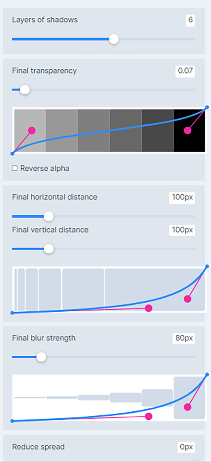
Simply set the properties, preview the box-shadow, copy and paste the code in your project and you’re set!
We’ve looked at how to layer shadows, how to create neon shadows and transform them into highlights, and how to bring realism online with neumorphic shadows. You’re well on your way to becoming a shadow expert!
Practice makes perfect, so try styling some shadows yourself. See how many box-shadow layers you can add to an element. Try combining colors and see what works. Remember to test on as many devices as possible for optimal performance.
на главную сниппетов